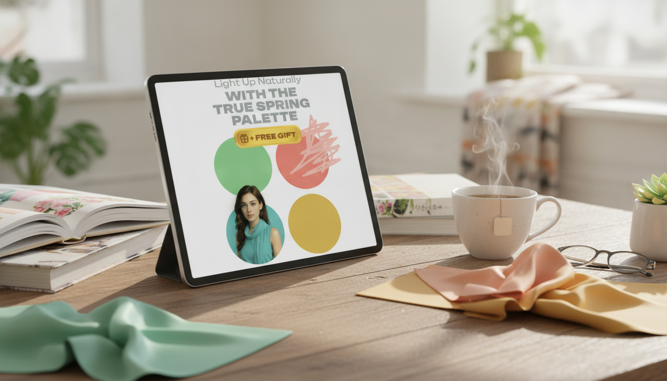
Light Up Naturally with the True Spring Palette
True Spring shines in colors that feel warm, clear, and sunlit—think fresh citrus, warm coral, and lively greens rather than muted or cool tones. When you wear the right True Spring shades, the effect is noticeably fresh: skin looks more even, eyes look brighter, and your overall look feels “awake” without needing heavy contrast. Below is a practical guide for confirming True Spring traits, choosing the most flattering color families, and building outfits that look bright and natural (not loud or costume-y).
What Makes a True Spring Palette Different
The True Spring palette is defined by three core qualities: warmth (golden undertone), clarity (clean chroma rather than dusty), and a medium-to-light value that reads fresh instead of deep. When these qualities line up with your natural coloring, the colors tend to look “lit from within.” Shadows soften around the nose and jaw, the under-eye area can look less emphasized, and the face reads smoother at a glance.
Mismatches are usually easy to spot. Cool or smoky shades can dull the complexion; very dark tones can feel heavy; and icy pastels can look stark or disconnected. Within the warm seasons, True Spring sits warmer and clearer than Light Spring, while also looking brighter and more golden than Warm (True) Autumn, which leans deeper and earthier.
Quick Self-Check: Are You Likely True Spring?
These quick comparisons can help you narrow it down before doing a deeper wardrobe audit:
- Undertone cues: Gold jewelry tends to harmonize, while bright silver can feel a bit sharp. Warm beige foundations often blend more seamlessly than pink-leaning ones.
- Contrast level: Usually low-to-medium contrast (features blend softly), but the overall look still has clarity—eyes and hair often appear crisp rather than ashy.
- White/cream test: Creamy ivory typically looks better than optic white; bright white can pull attention away from the face.
- Red test: Warm coral or tomato red tends to flatter more than blue-red or burgundy.
Your True Spring Color Map: Bright Warmths That Stay Natural
True Spring color families are vivid but not neon. If a shade looks “clean,” sunlit, and warm, it’s usually in the right neighborhood. (For a refresher on how hue, value, and chroma work together, resources like Color Matters and the Encyclopaedia Britannica overview of color are helpful.)
- Signature brights: coral, poppy, marigold, warm turquoise, leaf green—bright, lively, and clean-edged.
- Best light tones: warm peach, apricot, light butter yellow, warm aqua—clear rather than chalky.
- Supportive neutrals: warm ivory, oatmeal, warm beige, camel, light warm tan—choose clarity over grayness.
- Metals and finishes: yellow gold, warm rose gold, brass; glossy or luminous textures tend to echo True Spring clarity.
- Prints: warm backgrounds (ivory, cream) with bright, clean pattern colors beat muted watercolor effects.
True Spring Cheat Sheet: What to Reach For
| Category |
Best Choices |
Use It For |
Avoid When Possible |
| Neutrals |
Ivory, warm beige, camel, light warm tan |
Base layers, trousers, jackets |
Cool gray, charcoal, stark optic white |
| Accent colors |
Coral, apricot, tomato red, marigold |
Tops near the face, scarves, lip color |
Burgundy, blue-red, dusty mauves |
| Blues/greens |
Warm turquoise, aqua, leaf green, spring grass |
Dresses, knitwear, accessories |
Icy blue, slate, teal that turns smoky |
| Metals |
Yellow gold, warm rose gold, brass |
Jewelry, hardware, belt buckles |
Bright silver, gunmetal |
Wardrobe Building Blocks That Make Outfits Effortless
A True Spring wardrobe gets easier when you treat color like a simple system: a few “face colors,” a handful of warm neutrals, and repeated combinations that always look fresh.
- Start with 2–3 face colors: Choose a coral/peach, a warm aqua, and a spring green for tops, collars, and scarves.
- Choose neutrals that stay warm: Swap black for camel or warm tan, especially near the face.
- Denim tip: Medium, warm-wash denim often blends better than very dark indigo; avoid overly ashy fades.
- Workwear shortcut: Ivory blouse + camel trouser + coral accessory gives brightness without looking “extra.”
- Evening shortcut: Warm turquoise or tomato red with gold jewelry reads polished and lively.
If you want a streamlined reference you can keep on your phone, the True Spring palette digital guide is designed for quick checks while shopping or planning outfits.
Styling Ideas: True Spring Outfits That Look Bright, Not Costume-y
True Spring can handle color—just keep the overall structure simple so the clarity looks intentional instead of chaotic.
One small upgrade that often makes True Spring outfits look more “finished” is warm-toned hardware at the waist. A women’s skinny belt with retro gold buckle can add that golden highlight that naturally suits the palette—especially with ivory, camel, warm denim, or a coral top.
Makeup, Hair, and Accessories That Match the Palette
If you like referencing standardized color families while shopping, the Pantone Color Institute is a useful hub for understanding how different warm brights are categorized.
Common True Spring Mistakes and Easy Fixes
Using the Digital Guide to Do a Fast Closet Refresh
FAQ
Can True Spring wear black?
Yes, but it usually looks best away from the face or softened with warm, bright accents like coral or warm aqua plus gold/brass accessories. Many True Springs find camel or warm tan more flattering than black for tops and jackets.
What are the best neutral colors for a True Spring wardrobe?
Warm ivory, oatmeal, warm beige, camel, and light warm tan are reliable choices. The key is warmth plus clarity—cool grays and stark whites often look harsher as primary neutrals.
How do I tell True Spring from Warm Autumn?
True Spring reads clearer and lighter with a sunlit brightness, while Warm Autumn is deeper, more muted, and earthy. If dusty, brown-based shades feel heavy but clear coral and warm aqua look effortless, True Spring is the more likely match.
Recommended for you


Leave a comment