What colors should soft summers avoid?
Soft Summer coloring is typically cool-neutral, muted, and low-contrast. The quickest way to spot “wrong” shades is how they change the face: harsh colors can emphasize redness, shadows, or make features look washed out. In general, Soft Summers look best in gentle, smoky tones—and should avoid anything too bright, too warm, too dark, or too stark.
1) Bright, high-saturation colors
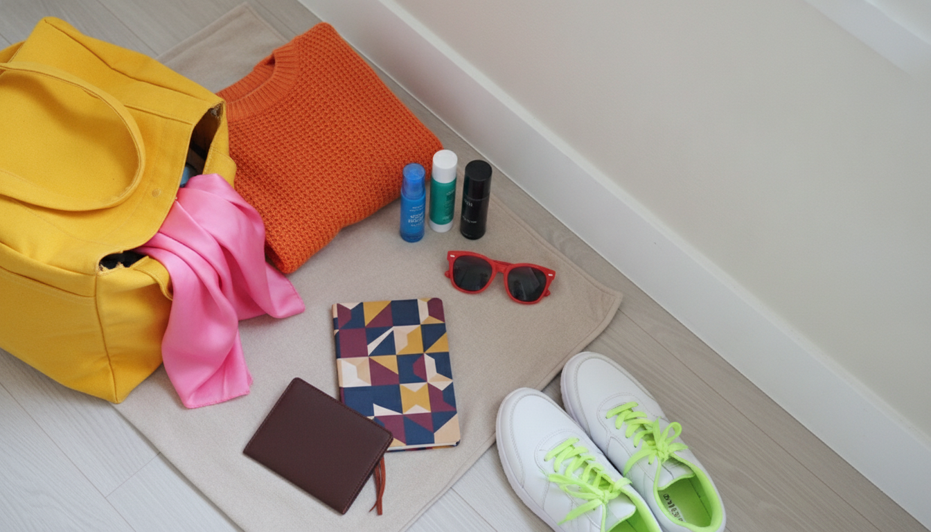
Neon and highly saturated shades (like electric blue, hot pink, vivid cobalt, and intense emerald) tend to overpower Soft Summer’s softness. Instead of looking fresh, the overall effect can feel loud or distracting, pulling attention away from your natural coloring.
2) Warm, golden, or orange-based hues
Soft Summer leans cool, so strongly warm colors often clash. Steer clear of orange, pumpkin, coral-leaning brights, tomato red, mustard, and warm golden yellows. These can make skin appear sallow or ruddy and can fight with naturally cool undertones.
3) Very dark or heavy shades
Deep, high-contrast colors such as black, ink navy, espresso brown, and very dark burgundy can feel too weighty. They may create sharp contrast that overwhelms delicate features. If you want a dark neutral, a softened charcoal or muted navy usually behaves better than true black.
4) Stark contrasts and icy extremes
Pure white and extremely crisp color blocking can look too sharp. On the other end, very icy pastels (like icy mint or frosty baby pink) can read too “cold and clear” rather than muted, making the complexion look flat.
5) Warm earth tones
Many classic earthy shades—camel, rust, terracotta, warm beige, and yellowed khaki—skew warm and can dull Soft Summer coloring. When choosing neutrals, look for cooler, grayer versions rather than golden ones.
For a deeper breakdown and more examples, visit the full guide here: What colors should soft summers avoid?
FAQ
What colors look best on Soft Summer?
Muted, cool-to-neutral shades usually flatter most, such as dusty rose, soft mauve, slate blue, smoky teal, lavender-gray, and cool taupe. The most harmonious choices tend to be “softened” with gray rather than bright or warm.
Recommended for you











Leave a comment